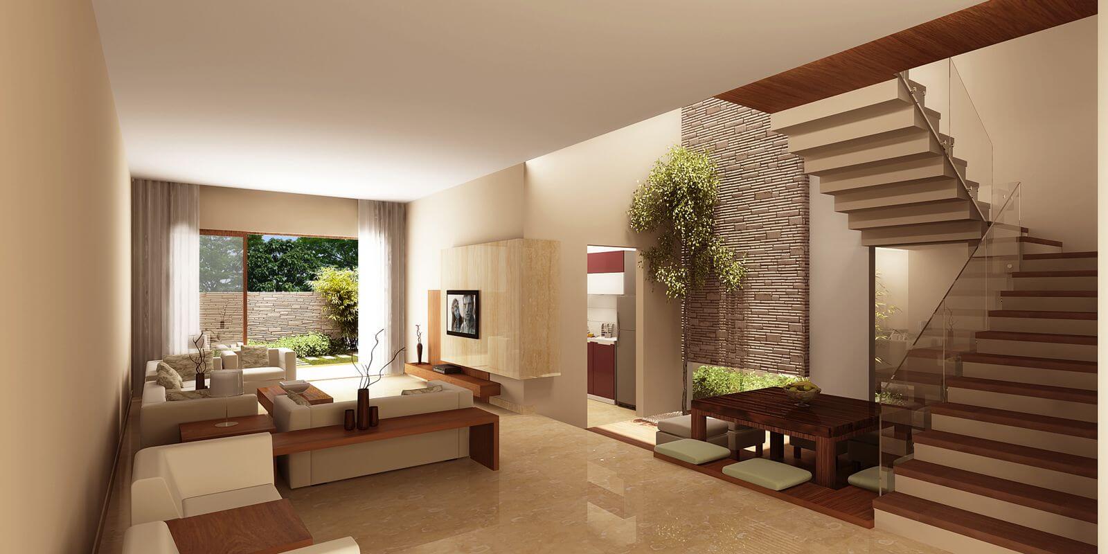
Behind the aesthetics and the lovely, charming spaces, there’s actually a not-so-appealing side of interior design: the rules. To pull off an aesthetically inviting room, you need to do the painful work of sticking to dos and don’ts.
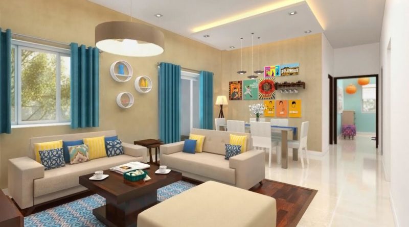
source: home-designing.com
One of which is the rule of three. The basic idea of this rule is to arrange or group things into three (or in odd numbers). Why three? It’s simple: It looks more natural. It doesn’t appear too staged or forced, so it becomes visually appealing. How do you reflect the rule of three in your own home? Here are some ways:
On Your House’s Exterior
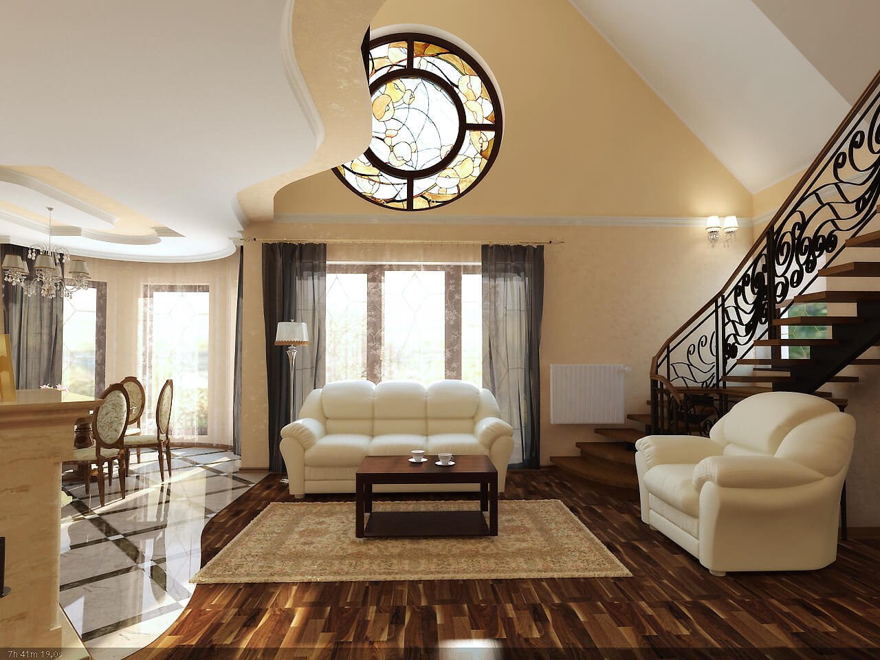
source: customfurnish.com
If you’re having trouble selecting colors for the exterior of your property, focus on three hues. You should be able to identify a dominant color, which would cover the siding, a secondary hue for the roofing, and then an accent color for the doors and windows. Take cues from the style of your home or the aesthetics of your landscaping as you choose colors. Notice the classic ranch-style home.
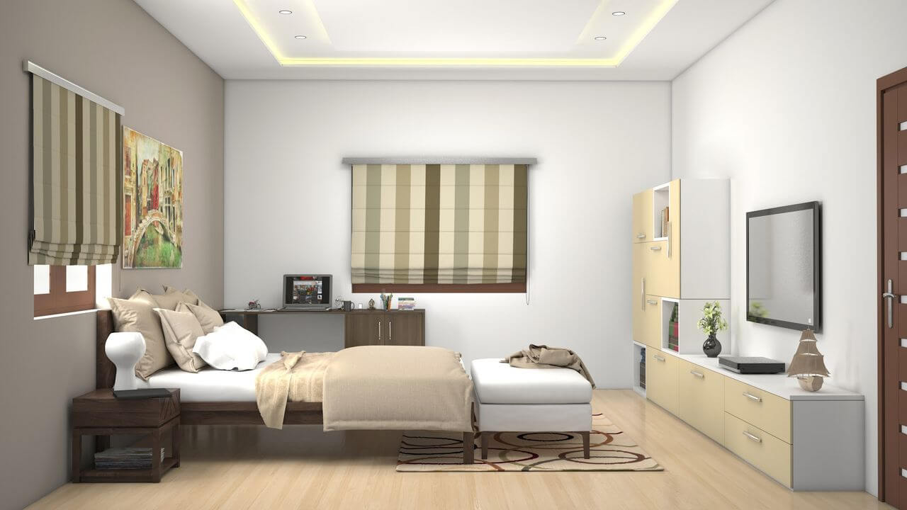
source: espectrum.in
It has the dominant brown in its siding, the complimentary black in its roof shingles, and then pops of whites in the architectural lines, like the arches of the windows or columns, or in the add-ons, like shutters or retractable window awnings. Aside from the colors of the exterior, you can also use the rule of three in introducing different textures. The popular mix of materials is wood, metal, and stone. Mix these elements, and you’ll have different points of visual interest already as part of the curb appeal.
On Your Furniture
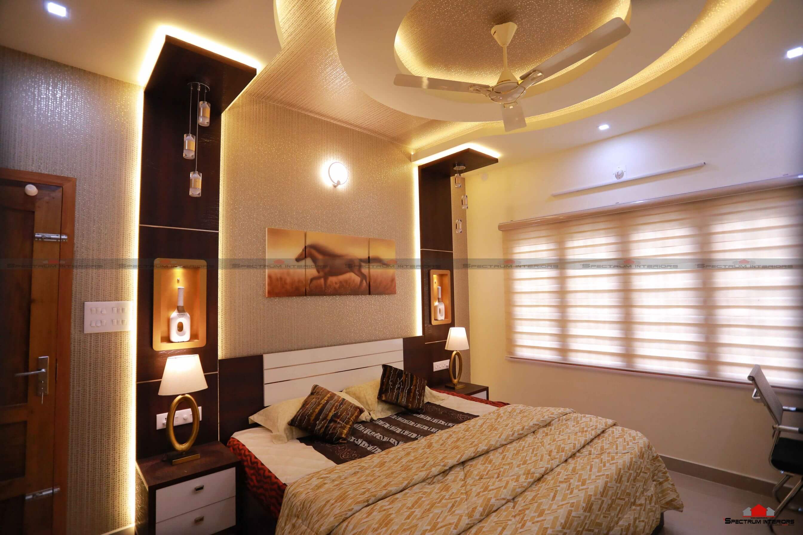
source: myhomedesign.000webhostapp.com
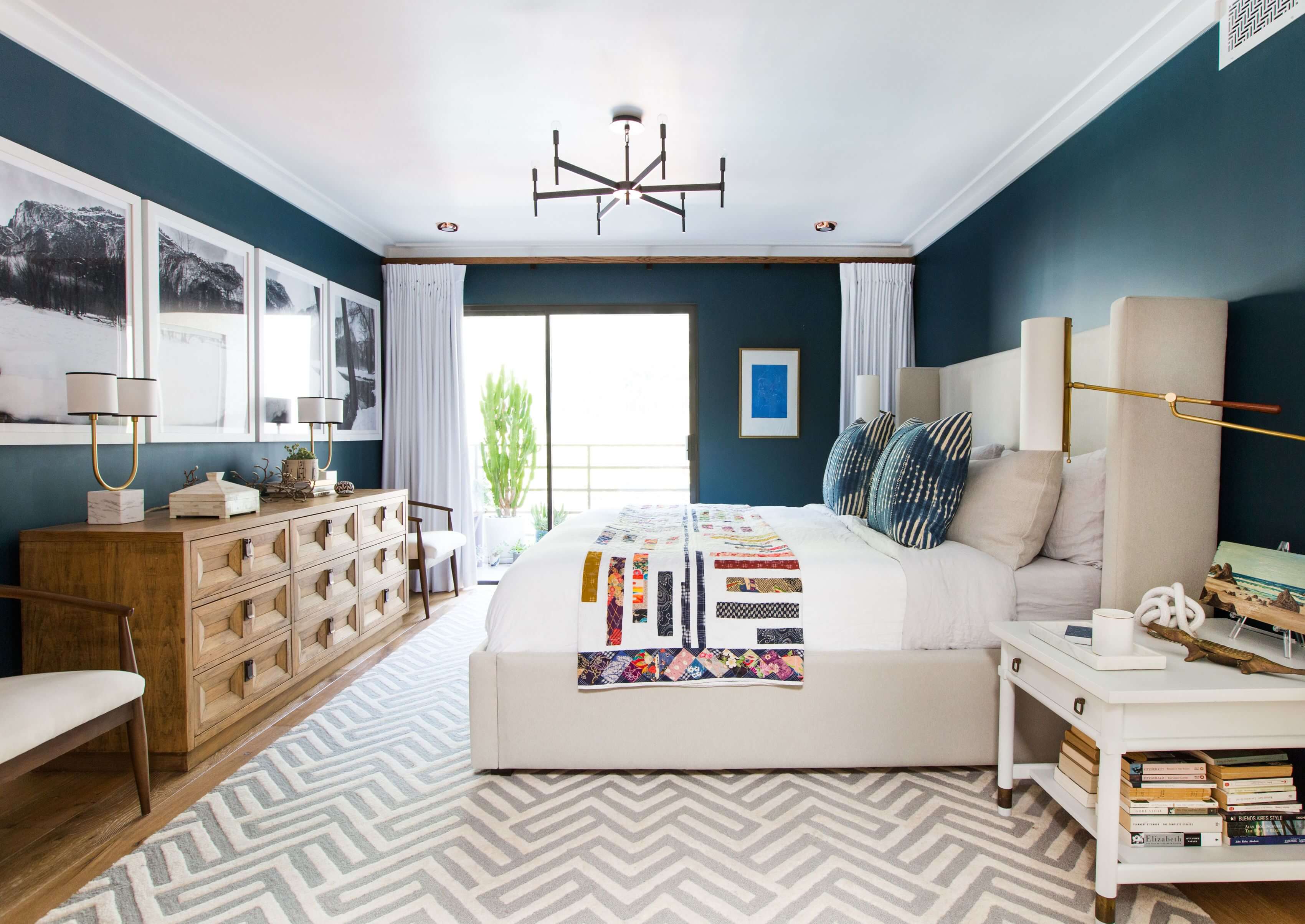
Pay attention to the images in interior design magazines, and you’ll notice that a lot of them have furnishings arranged in three. A sofa in the middle of a living room with two couches on its sides. A bed as the focal point of a bedroom with two side tables sandwiching it. These are the classic examples.
To pull this off in non-conventional elements, particularly furnishings that aren’t similar, you only need to remember one thing: Strive for uniformity in shape or size. For instance, when you’re trying to group elements for a foyer vignette, your cabinet, console table, and lounge chair should have almost the same dimensions. This subconsciously influences the mind to group things together and thus achieve the natural look of magic three in design.
On Your Accessories
source: pinterest.com
The rule of three extends to the details in your design. At your coffee table, for instance, stack three books for added visual appeal. At your kitchen island, too, group three large vases: one for holding flowers, another for the cookies, and then another just for aesthetics. Don’t miss out on the gallery walls. Organize your photos or art pieces in three. When it comes to similar objects, you can vary the size and shapes. In fact, this is a better take in decorating because it offers contrast, which makes the entire thing more visually interesting.
Again, the key to pulling off a pleasant interior design is to do the not-too-creative job of following the rules, especially the rule of three. Remember this concept as you beautify your space.

