Designing successful wayfinding systems for university, college and other educational campuses come with many challenges. These are large places and big organizations that demand a high-quality, consistent wayfinding system for smooth operation.
The Challenges
source: gnugroup.com
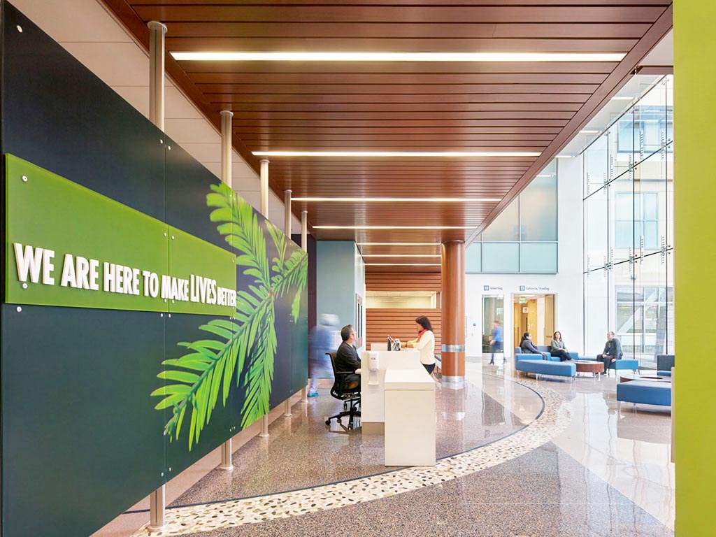
First is the scale of a typical college campus. Most have facilities dispersed across a large area that cater to thousands of people. There are even several universities in the US with upwards of 50,000 students on roll. When you add administratively and teaching staff, plus additional campus visitors, that’s a lot of people. Wayfinding must ensure that all these people can move around campus safely, efficiently and on time for classes.
Most campuses are also mixed-use with both accommodation and academic learning facilities. There may also be members of the public regularly on campus to use the theatre or sporting or concert facilities. Wayfinding systems must facilitate a good visitor experience for all people using the campus for a far-reaching range of reasons.
Branding is central to campus wayfinding solutions as well. There should be a distinct visual identity to effectively incorporate into wayfinding design solutions. Education is a competitive marketplace and most colleges and universities have realized the importance of branding to set themselves apart. A wayfinding system is always an important element to consider when developing a branding strategy for any establishment, be it in the fields of retail, hospitality, medical, education, or others.
The Solutions

source: visix.com
An effective wayfinding system on campus will provide the following benefits:
- Students and staff arriving on time for classes and meetings, especially after a new intake of people has occurred
- The smooth flow of a large volume of people moving around, with minimal congestion and safety issues
- A positive visitor experience for everyone using the campus
- A good opportunity for building and reinforcing brand identity
Here are some tips for providing a high-quality wayfinding system:
1. Engage in extensive research
source: thedailycougar.com
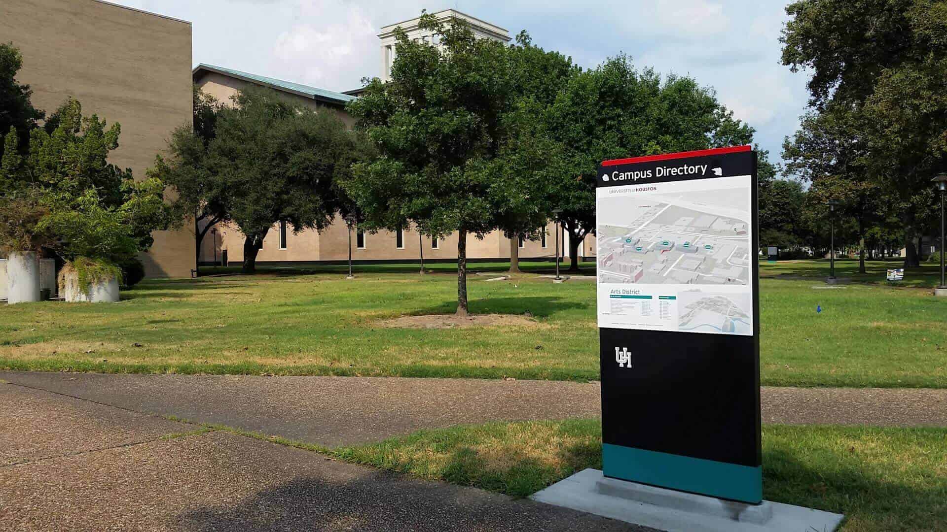
It’s really important to have a full picture of the kinds of journeys people on campus are making. This is achieved through the observation and interview of multiple users.
Detailed observation can reveal pinch points where congestion is a problem. It can also strongly indicate where visitor confusion is arising and where signage needs to be placed.
Be sure to interview multiple users: students, administration and teaching staff, and plenty of visitors attending for a multitude of reasons. This will reveal how they currently navigate the campus and where potential areas for improvement can be found.
2. Create user personas to test the new system
source: pinterest.com
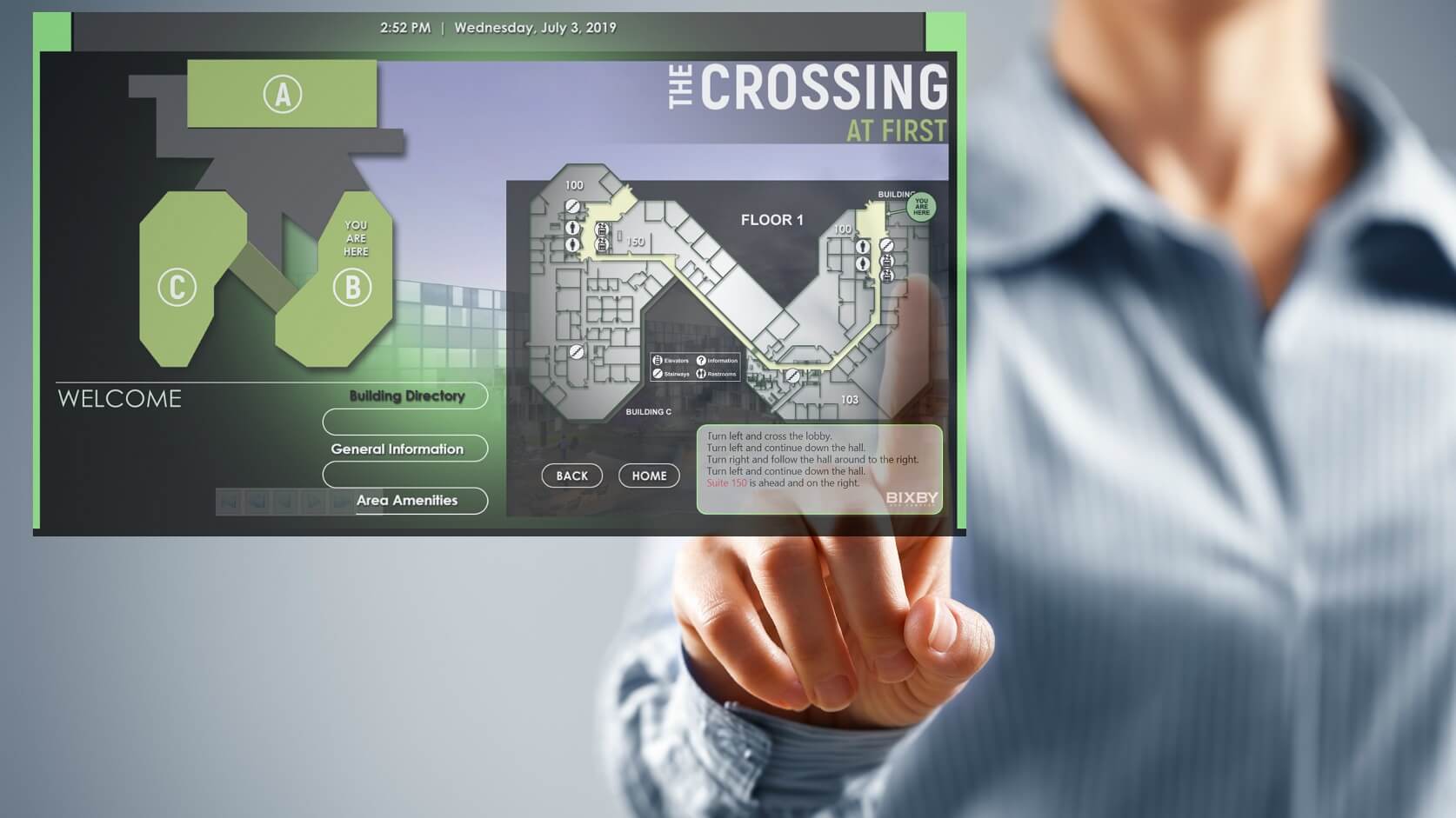
Creating several typical user personas based on interviews and observations will have many benefits. These personas can be used throughout the design process to guide and inform. They can also then be used to road-test, to evaluate, and to fine-tune the new system.
When volunteers take on these different personas later in the design process, they can put themselves in the shoes of everyday users of the campus. It’s particularly important to create user personas for occasional visitors. Can they find the buildings and rooms they need? Are they using the most efficient route? Is it a pleasant visitor experience?
It’s of equal importance to create personas of people who may need to navigate in a different way: users of wheelchairs, people with visual impairment, or people who may find using the local language difficult, for example.
A wide range of user personas will ensure the system has been adequately tested and that all users can navigate successfully once the new system goes live.
3. Aim for simplicity
source: lhsigns.com
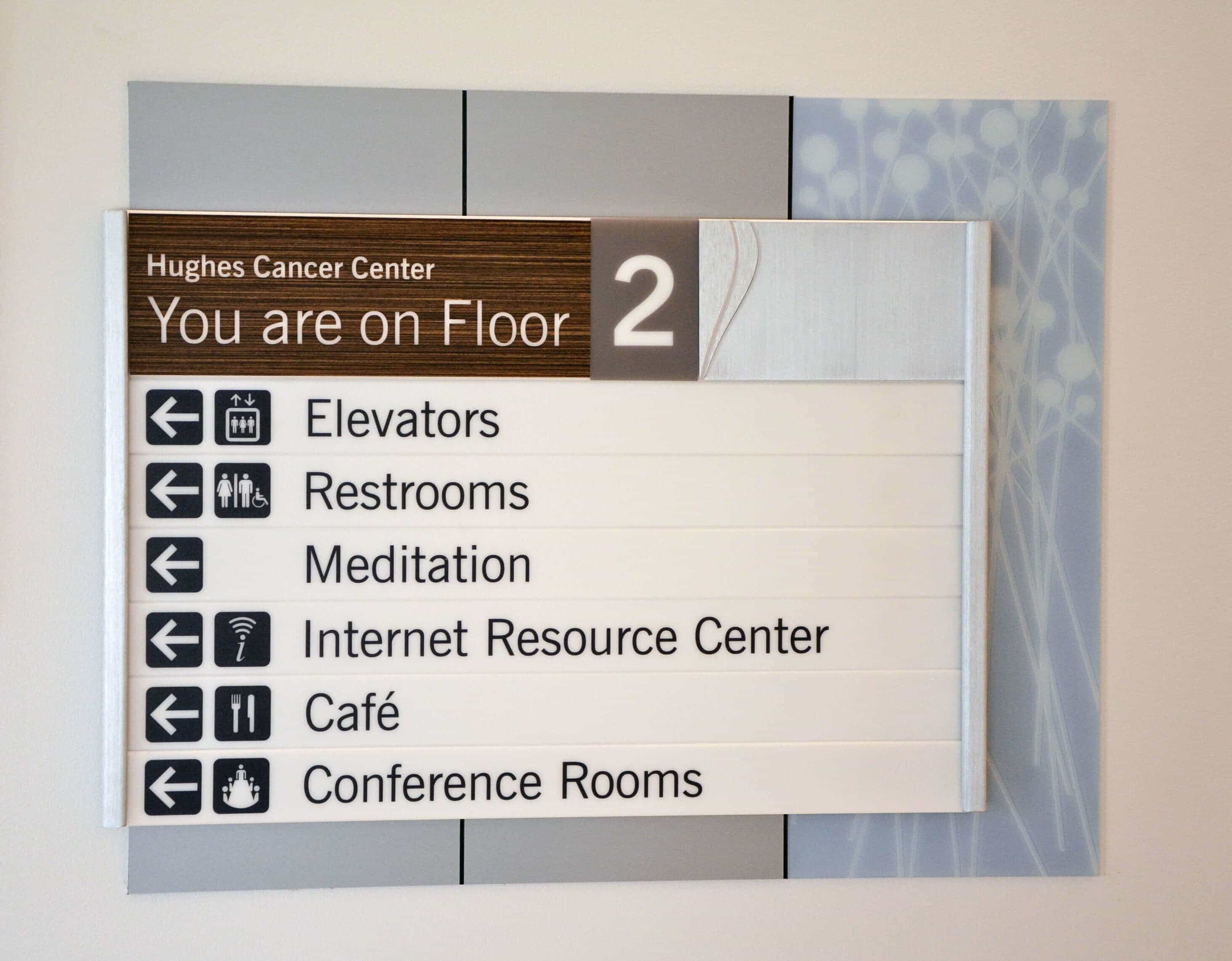
The signage of a wayfinding system needs to be understood by a wide range of individuals, and quickly. The fewer words you use, the better. The same applies to images and visual distractions. Can your signage be understood quickly enough that people do not need to stop walking?
Use simple, easily understood words and consider that a symbol or pictogram may do a better job than words.
4. Pay close attention to signage location and placement
source: harkess-ord.com
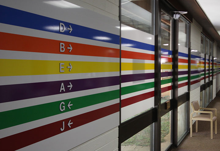
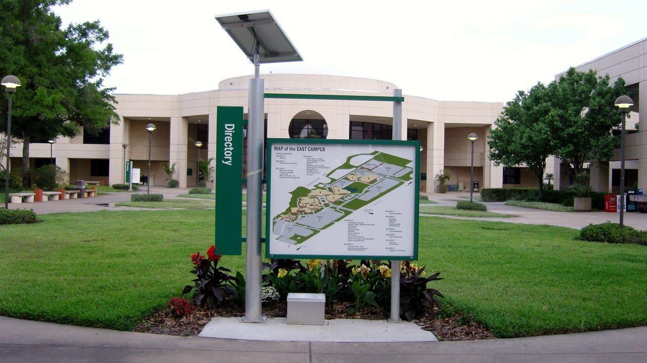
Wayfinding signage needs to be placed in any position where a person may need to change direction or make a navigational decision. These include exits and entrances to buildings, parking lots, and other distinct areas. You will need to place signage at all junctions on campus. You may also want to consider signage that reassures the user of the correct direction along longer, unbroken pathways.
Also, carefully consider the placement of your wayfinding signage. Where is the best position for it to be easily located and quickly read? You can mix and match the types of signs you use for the best user experience. Wall signs, hanging signs and freestanding pillars are all popular options.
You may also like to know about Technology Breakthroughs: Role of AI in Wealth Management
5. Use a professional wayfinding system design agency
source: apple-designs.com
You will have considered budgeting for the manufacturing of your signage, but you should also carefully consider using wayfinding design consultants. Their professional expertise can ensure that you fully realize the potential benefits of a new system through improved traffic flow, a better user experience, and visually pleasing, effective, on-brand signage.
Often, when we are very familiar with a place, we find it difficult to imagine navigating a place for the first time or with different purposes in mind. Using a professional design service that can research, strategize and design on your behalf helps you overcome this difficulty and frees up your time. They will use the four strategies listed above, as well as others, to ensure your wayfinding is attractive, fully cohesive, user-friendly, and totally fitting for a large educational campus.
AUTHOR BIO
Zak Zakaria is a Waymaker at design technic in Dubai who also previously worked as the company’s Graphic Designer and Art Director. Zak is a creative with work experience in multiple multinational agencies such as JWT and Saatchi & Saatchi. Signage design is a family business, making Zak’s personal experience with signage his longest professional commitment.


